Posts

Showing posts from January, 2018

Anatomy of Typeface

Image
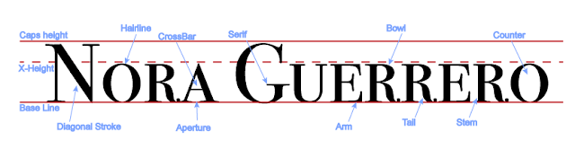
   For this project we typed our name in Adobe Illustrator and made a diagram of the anatomy of typeface. I created red lines to represent the Baseline, X-height, and Caps height. I followed the instructions from a video provided by our teacher. I chose the colors red and blue because I felt the colors contrasted each other very well. We were instructed to point out at least thirteen parts of the anatomy including the Baseline and both X and Caps height.    We also learned about the importance of typeface. Typeface/font can have a huge influence un adds and flyers, it can really determine whether the public will take you seriously or not. Some fonts are known for their 'unprofessional' look, such as Comic Sans. Sans is french for 'without' which is usually used to state that a font does not have a serif. A serif is like a little tab that sticks out the of the end of a letter. Fonts with a serif include Times New Roman and Georgia. Fonts without a serif usually have s

Color Wheel

Image
  For this project we had to recreate a color wheel. We included the Primary, Secondary, and Tertiary colors. The Primary colors Yellow, Blue, and Red, make up all the other colors. Secondary colors are made up of the Primary colors and when you mix those two you get Tertiary colors. Of course there are thousands of shades, tints, and colors but these are just the basics.   We learned how to create shapes and text on Adobe Illustrator. Since we have worked with Photoshop before, we learned the similarities and differences between the two. If I were to do this project again I would try to be more creative with the colors and shapes. We learned how to work with some of the simple tools and how to create simple shapes and text boxes. I really enjoyed working with Illustrator and look forward to using it in the future. 

Color Schemes of Logos

Image
Analogous This logo uses the analogous colors of red and orange I think the company probably chose the colors because they give a sense of superiority, that would maybe catch the customers attention and draw them to their company and not others.  The Subway logo uses the analogous colors of green and yellow, the company might have chosen those colors because they represent fresh products, and Subways catchphrase is "Eat fresh". Complementary FedEx uses the complementary colors violet and orange. They might use those colors to give the company a sense of stability and safety so customers have more faith in them. The colors violet and yellow are used by Taco Bell, again it might be to give themselves recognition of stability.  Warm The Lego Logo uses the warm colors of red and yellow, I think they might have done this to give customers a sense of joy. This logo also uses the warm colors red and yellow, I think for the same rea