Posts

Anatomy of Typeface

Image
   For this project we typed our name in Adobe Illustrator and made a diagram of the anatomy of typeface. I created red lines to represent the Baseline, X-height, and Caps height. I followed the instructions from a video provided by our teacher. I chose the colors red and blue because I felt the colors contrasted each other very well. We were instructed to point out at least thirteen parts of the anatomy including the Baseline and both X and Caps height.    We also learned about the importance of typeface. Typeface/font can have a huge influence un adds and flyers, it can really determine whether the public will take you seriously or not. Some fonts are known for their 'unprofessional' look, such as Comic Sans. Sans is french for 'without' which is usually used to state that a font does not have a serif. A serif is like a little tab that sticks out the of the end of a letter. Fonts with a serif include Times New Roman and Georgia. Fonts without a serif usually have s

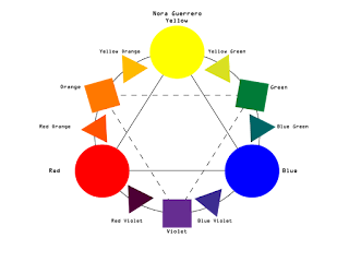
Color Wheel

Image
  For this project we had to recreate a color wheel. We included the Primary, Secondary, and Tertiary colors. The Primary colors Yellow, Blue, and Red, make up all the other colors. Secondary colors are made up of the Primary colors and when you mix those two you get Tertiary colors. Of course there are thousands of shades, tints, and colors but these are just the basics.   We learned how to create shapes and text on Adobe Illustrator. Since we have worked with Photoshop before, we learned the similarities and differences between the two. If I were to do this project again I would try to be more creative with the colors and shapes. We learned how to work with some of the simple tools and how to create simple shapes and text boxes. I really enjoyed working with Illustrator and look forward to using it in the future. 

Color Schemes of Logos

Image
Analogous This logo uses the analogous colors of red and orange I think the company probably chose the colors because they give a sense of superiority, that would maybe catch the customers attention and draw them to their company and not others.  The Subway logo uses the analogous colors of green and yellow, the company might have chosen those colors because they represent fresh products, and Subways catchphrase is "Eat fresh". Complementary FedEx uses the complementary colors violet and orange. They might use those colors to give the company a sense of stability and safety so customers have more faith in them. The colors violet and yellow are used by Taco Bell, again it might be to give themselves recognition of stability.  Warm The Lego Logo uses the warm colors of red and yellow, I think they might have done this to give customers a sense of joy. This logo also uses the warm colors red and yellow, I think for the same rea

Final Project

Image
 Building this website was a very insightful experience. I really enjoyed learning how code and other factors go into making a functional website. We followed along with a series of videos that instructed us on what to do. We embedded two projects from this semester and reflected on our work. We also got to change the theme and customize our website.   Video embedded in website Projects Page of Website Home Page of Website I learned a great amount about Dreamweaver and how it works. Building a website is so much more than just typing and choosing a theme. You have to create a hook and put effort into it because if you mess up, your project could easily go down the drain. Code plays a big part in a website, I learned how to work with code and have the links in the website function correctly. If you follow instructions, building a website isn't extremely difficult.  Overall, I think my project is adequate. Next time I would definitely try to be more creative and spen

Chase Scene

Image
  The chase scene was definitely more difficult than the other two projects. We did not have a lot of preproduction time but tried to make it work. We had some continuity issues involving clothes but we didn’t have enough time to reshoot. Our group worked decently well together, but I would definitely do things differently if I had the time. Overall the final project is decent in my opinion but could have been better.

Moving from Point A to Point B Sequence

Image
  The planning and filming process went by very quickly for this project. We did have a limited amount of time as we are going on thanksgiving break soon, thankfully we finished brainstorming and filming in time. We tried to make a video with a 'James Bond' sort of vibe, but way better (please note the sarcasm). We filmed in the halls and in the cafeteria. When it came to editing I tried to find a song that gave off a secret spy feel for the video so the viewer could get what it was about. I tried to play with the audio and have it match some of the movements in the video. I was inspired by Edgar Wright as he incorporates music in his films in a very choreographed way. Some examples of this are Shaun of the Dead, Baby Driver, and The Worlds End. Of course mine was not as professional or advanced as Wrights, but I did try. Overall the video was easy to film and though we had a limited amount of time it was not much of a struggle.

How To Print A Document

Image
  For my “How To Print A Document” video the creative process went by very quickly. Our group was very productive and on task. We planned out our scenes on a story board first then we went onto filming. We filmed in the school library, we didn’t take long but did have to reshoot a scene. We had one actor and a person behind the camera. We all incorporated some ideas and helped with the equipment. We did our best to get all the shots necessary, if I could do something differently it would be to get more creative shots. Overall I think our group worked well together and I am content with the finished product.